News 10.23.2006
 This may be old to some, but I haven't had a chance to say much about it. Cisco shows its new logo, and it looks very "Web 2.0", which I guess is okay. It will take some getting used to for some, and will likely throw people off with the new look of the site as well. Overall, everything looks a lot cleaner to me.
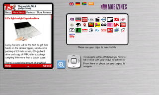
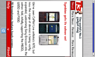
Mobizines has created a version of its flash-based magazine application for the 770, and it looks nice. The interface works well for the Internet Tablet screen, and there is a good amount of content to check out from the site. It really provides an interesting navigation setup that makes use of portrait orientation of the device. I'd like to see more mobile centric web design like this come to more mobile platforms in the future.
Landscape Mode

Portrait Mode


0 Comments:
Post a Comment
<< Home